For design to stand out and be spectacular, adequate focus on typography is important. One quick search on the internet provides multiple examples of good designs that are thwarted because of poor typography.

Typography in its most basic sense is the art and technique of type design and arrangement. Contrary to popular belief, it isn’t just about choosing a font that looks good.
Messaging: The right font can help your brand convey a particular message as intended.
Evoking emotion: Font associations make it possible for brands to evoke specific emotions in the minds of audiences with particular fonts. E.g. Comic Sans for levity, Georgia for serious messages and so on.
Setting the mood: Studies show that good typography elevates audience mood which improves their attention to the message and heightens receptivity
Improves engagement: Research has indicated that good typography can command and hold the attention of the reader. It accounts for higher engagement during reading.
Influences action: Typography’s effects aren’t limited to the current state alone. When it’s right, it can influence audience action.
When it comes to examining the psychological effects that typography can have, some concepts are important to be cognizant of.
Visual rhetoric of text: Visual elements in a design can culminate in creating the overall impression of the design. They signify semantic aspects and provide a broader explanation of the document. They also convey what text does not or cannot. This is visual rhetoric. It establishes credibility and affects the overall tone of the document.
Semantic Memory: Semantic memory as a theory helps explain how typography influences audiences. Fonts are considered to have meaning and significance. Whenever an individual sees a font, an earlier experience is recalled. In the case of the previous and current experiences being similar, the perception is reinforced. This is also how font associations are formed.
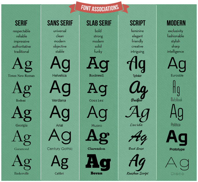
It is important for businesses to recognize that certain font families create specific impressions on audiences. Some broad associations are provided below.

The evolution of typography, from print to web, is a fascinating read to say the least. Here is a quick recap of what transpired.
In hindsight, the introduction of desktop publishing revolutionized typography like never before. It created possibilities for designers and type foundries to create countless stunning typefaces for every possible requirement and have finer control over arrangement and positioning. In fact, web typography began emerging as a clear winner over print because of the distinctive advantage – allowing users to control the appearance of type based on their needs. Web typography can also be made unique or differentiated because of services such as Typekit, Google web fonts, Fontdeck and so on. Web typography will continue to evolve in surprising and delightful ways as audience requirements and communication devices change and develop.